Why One Pantone Reference Produces Four Different Shades Across a Branded Stationery Gift Set
One of the recurring production issues I manage on the factory floor—and one that almost never surfaces during the procurement stage—is the assumption that a single Pantone reference will produce a single visual result across every material in a branded stationery gift set. The procurement team specifies PMS 289C, or PMS 186C, or whatever their brand guidelines dictate, and they expect that the leather notebook cover, the metal pen barrel, the paper presentation box, and the fabric drawstring pouch will all arrive in the same shade. They will not. They cannot. And the reason has nothing to do with production negligence or supplier incompetence. It has to do with the physics of how pigment interacts with substrate, and the fact that corporate brand guidelines were written for screens and print, not for three-dimensional objects made from fundamentally different materials.
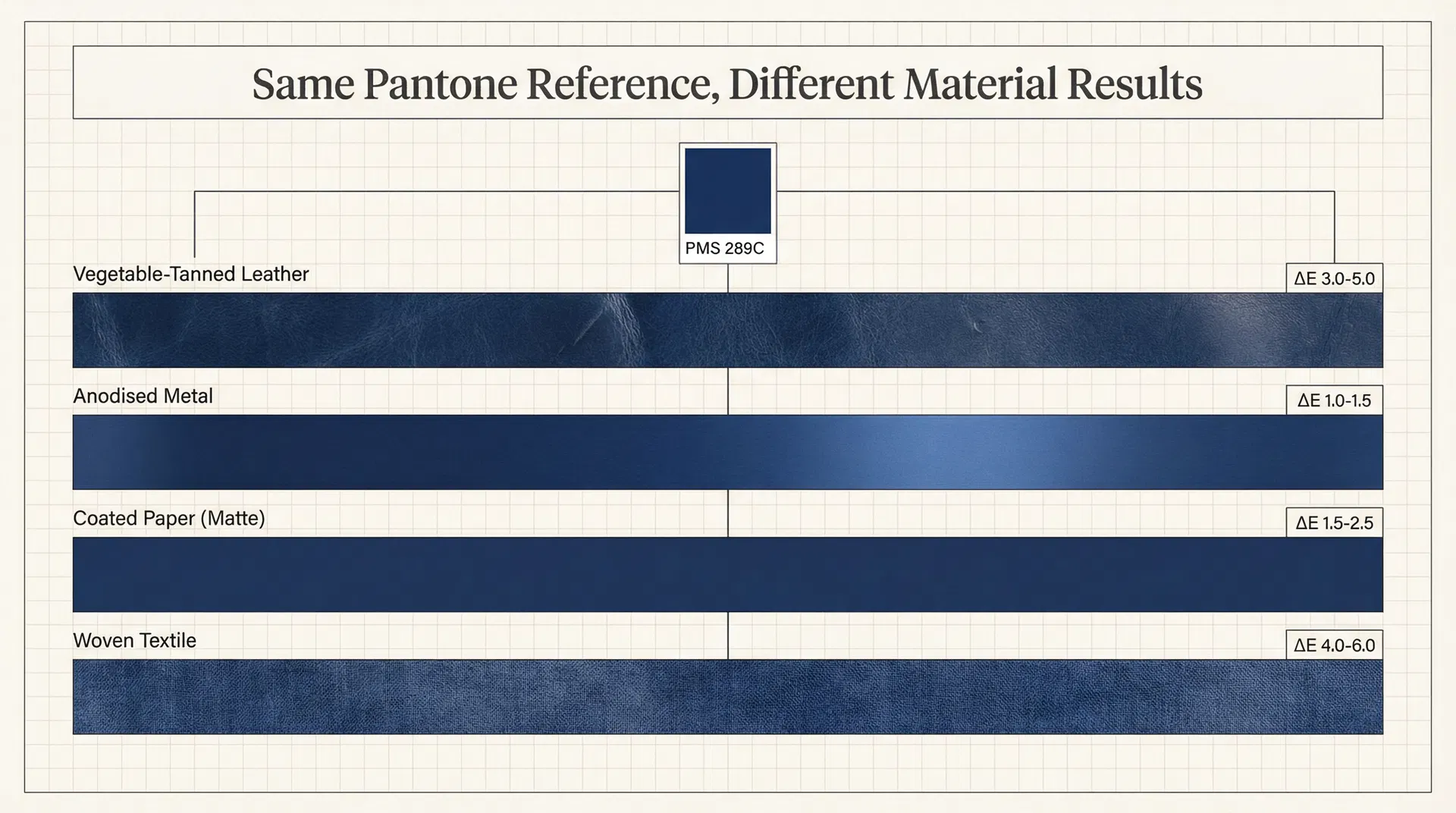
I have managed colour matching across multi-material corporate gift sets for factories supplying the UAE market for close to fifteen years, and the pattern is remarkably consistent. The procurement brief arrives with a brand guidelines PDF, a Pantone reference, and sometimes a digital colour swatch. The brief assumes that this single reference is sufficient to produce colour consistency across the entire set. What the brief does not account for is that each material in the set absorbs, reflects, and renders pigment through entirely different mechanisms. Leather is a porous, organic surface with its own base tone—typically warm beige or grey depending on the tanning process—and the dye penetrates the fibre structure rather than sitting on top of it. The same PMS 289C that appears as a deep, saturated navy on a coated paper swatch will render as a slightly warmer, less saturated navy on vegetable-tanned leather because the leather's undertone shifts the perceived colour. Metal, by contrast, is a non-porous, reflective surface. The colour is applied as a coating—anodising, powder coating, or lacquer—and the metallic substrate beneath the coating introduces a luminosity that the same colour on leather or paper simply does not have. The navy on the pen barrel will appear cooler and slightly more vivid than the navy on the notebook cover, even though both were mixed to the identical Pantone formula.
The paper presentation box introduces a third variable. Coated paper stock absorbs ink differently depending on the coating weight, the paper's brightness level, and whether the printing process is offset, digital, or screen. A 300gsm coated art board with a matte lamination will render PMS 289C with less saturation than the same colour on a gloss-laminated board, because the matte surface diffuses reflected light and softens the colour's apparent depth. If the box includes a fabric lining or a ribbon closure, that introduces yet another substrate—textile—where the dye is absorbed into woven fibres and the colour's appearance shifts again depending on the weave density, the fibre composition, and whether the fabric has been pre-treated with a sizing agent.
The result, when a procurement team specifies a single Pantone reference without material-specific calibration, is a gift set that arrives with three or four visibly different shades of what was supposed to be one colour. The differences are not dramatic enough to constitute a defect—no individual component is "wrong"—but they are visible enough to undermine the impression of precision and quality that a branded gift set is supposed to convey. The recipient opens the box and sees a navy notebook that is slightly warmer than the navy pen, which is slightly more vivid than the navy box, which does not quite match the navy pouch. The overall impression is not "this company has impeccable brand standards." The impression is "something is slightly off," and that impression, once formed, is difficult to reverse.
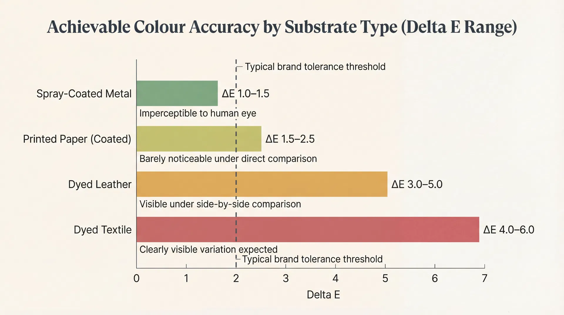
In practice, this is often where corporate gift type decisions start to be misjudged—not because the wrong product was selected, but because the specification process treated colour as a single variable when it is actually a matrix of material-specific variables that must be managed independently. The procurement team that specifies "PMS 289C across all components" has given the factory one instruction where four were needed. Each material requires its own colour target, its own tolerance range, and its own sample approval. The achievable colour accuracy on spray-painted metal is measured in Delta E values of 1.0 to 1.5—essentially imperceptible to the human eye. The achievable accuracy on dyed leather is Delta E 3.0 to 5.0, which is perceptible under direct comparison. The achievable accuracy on printed paper sits somewhere between the two, depending on the print process and coating. And the achievable accuracy on dyed textile is the widest of all, often Delta E 4.0 to 6.0, because fibre absorption is inherently less controllable than surface coating.
What this means operationally is that a factory managing a multi-material gift set must make a series of production decisions that the procurement team never sees. The factory's colour technician will mix the leather dye to the closest achievable match, knowing that it will sit warmer than the Pantone chip. They will adjust the metal coating formula to compensate for the substrate's reflectivity, pulling the colour slightly warmer to bring it closer to the leather. They will calibrate the print profile for the box to sit between the leather and the metal, creating a visual bridge. And they will select a textile dye lot that falls within the acceptable range for the fabric components. None of these adjustments are specified in the procurement brief. They are production-level decisions made by experienced technicians who understand that cross-material colour harmony is not about hitting the same spectrophotometer reading on every substrate—it is about managing the perceived visual relationship between substrates so that the human eye reads the set as cohesive.
The problem arises when the procurement team does not understand this process and evaluates the finished set against the original Pantone chip rather than against the cross-material harmony that the factory has carefully engineered. I have had clients reject finished production because the leather "does not match" the metal, when in fact both components have been optimised to create the best possible visual cohesion given the physical constraints of their respective materials. The rejection triggers a re-production cycle that adds three to four weeks and increases cost by fifteen to twenty percent, and the re-produced set will exhibit the same material-specific colour variation because the variation is inherent to the materials, not correctable through production adjustment.
The cost of this misunderstanding extends beyond the immediate production cycle. When a procurement team rejects a colour match that is actually within the achievable tolerance for the material, the factory faces a choice: absorb the cost of re-production to maintain the client relationship, or educate the client about material-specific colour behaviour and risk being perceived as making excuses. Most factories, particularly those serving the UAE corporate gift market where relationship continuity is commercially critical, choose to absorb the cost. This creates a hidden subsidy that inflates the factory's cost base and eventually surfaces as higher quoted prices on future orders. The procurement team that insisted on an unachievable colour match on one order ends up paying for that insistence across every subsequent order, because the factory has learned to build a colour-rejection contingency into their pricing.
The more effective approach—and the one that consistently produces better visual results at lower total cost—is to specify colour at the material level rather than the set level. Instead of one Pantone reference for the entire gift set, the procurement brief should include a primary colour target for the lead material (typically the largest surface area, which in a stationery set is usually the notebook cover), and then define the acceptable relationship between that lead material and each secondary material. The metal pen should be "within visible harmony" of the leather, not "identical to the Pantone chip." The paper box should be calibrated to bridge the leather and metal tones. The textile components should be approved based on a physical swatch comparison against the actual leather sample, not against a printed colour guide.
This approach requires one additional step in the procurement process: a cross-material colour approval stage where the factory presents all component materials side by side, under the lighting conditions that approximate the recipient's environment, and the procurement team approves the set as a visual whole rather than evaluating each component against an abstract standard. That single step—which adds approximately one week to the sampling timeline—eliminates the most common source of production rejection in multi-material corporate gift orders and produces a finished set that looks deliberately coordinated rather than accidentally mismatched. The teams that understand how gift type selection intersects with production realities are the ones that build this cross-material approval into their timeline from the start, rather than discovering the colour variation after the production run is complete.
There is a broader lesson embedded in this colour-matching challenge that applies to how procurement teams evaluate corporate gift quality in general. The assumption that a specification can be reduced to a single reference—one Pantone code, one material grade, one finishing standard—reflects a procurement mindset that works well for commoditised products but fails for customised, multi-material products where the interaction between components determines the perceived quality of the whole. A branded stationery gift set is not five separate products that happen to share a box. It is a single impression composed of five materials that must work together visually, tactilely, and functionally. Managing that impression requires specification depth that goes beyond what a brand guidelines PDF was ever designed to provide—and the procurement teams that recognise this early are the ones whose gift sets arrive looking like they were designed as a unified object, rather than assembled from separately manufactured parts that happen to share a colour name.